top of page


Nourish is a delivery food service, similar to Blue Apron, providing locally sourced organic foods with curated recipes. The goal was to create a value based brand, using market research of the potential customer base to craft the identity.
Nourish
Variety and quality 47.83%
Customer Research
What would you EXPECT of a food service like Blue Apron? Please choose the option that is most important to you personally.
Speed and variety 21.74%

Quality and speed 30.43%
If you are forced to choose, (in the course of a normal day) do you usually eat something efficient or something nutritious?
*This is a small sample of the questions asked in the survey.
Nutritious 43.48%
Efficient 56.52%

Brand Values
These values were chosen based on the research done on what customers want from this service, and their feelings about the organic food industry, a small sample of which is shown above.
Quality
Variety
Approachable


1/3
Initial Logo Sketches
Color and Logo Exploration

Palettes and logos that were brought forward but not chosen. They either did not match the feeling/values the brand was supposed to evoke, or didn't feel like an "organic" identity.


Final Palette and Logo
#F29D83
#B1D56E
#64BD60
#1C8F45

Stationery
These stationery sets were not used, reasons varied; too clunky, too old fashioned, sparse, among other things. This was also a test run for some of the color palettes that did not end up being chosen.


This final set is soft, simple and clean while not feeling too minimal, the palette is approachable, and the graphics less heavy to the eye.
Final Stationery

Brochure

The brochure was designed to match the stationery in it's soft and simple feel, but to use photography to emphasize the usability/approachability of the service, as well as the quality of the ingredients.
Text: adapted from plated.com - text was provided unsourced during the assignment


1/3
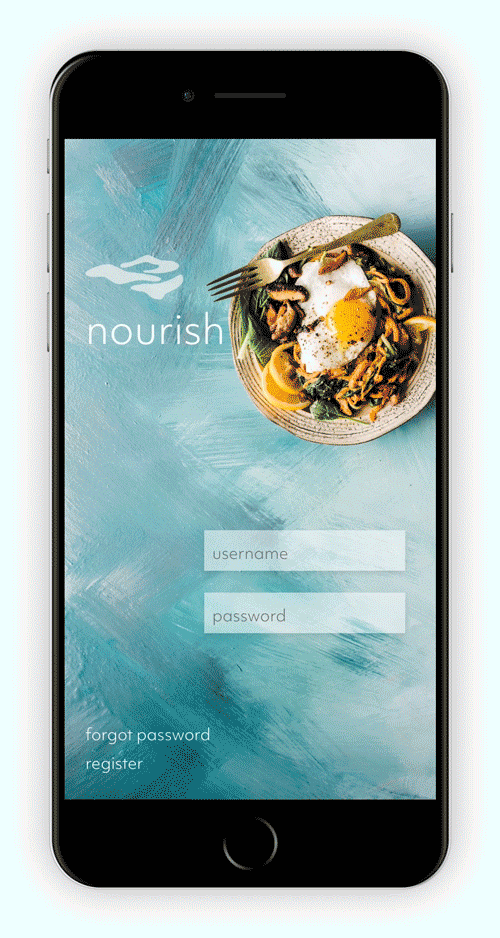
The app for this project included a locating service that showed local farmers’ markets where Nourish would be holding recipe demos, and would also tell you which vendors at that market were providers of Nourish’s produce.
Designed with a customizable interface specific to the user's preferred color palette/image, the user would swipe through screens.

Wireframes


App Design
App Landing Page

Dealing only with user flow, the app needed to be functional and easy to use. Similar to the brochure, the app needed to let image speak and not complicate things by being too high tech.
bottom of page